Some intriguing 3D visuals have been coming across my radar recently, which have inspired me to try building a few myself!
It started with just reproducing some cool visuals, but I was surprised how much could be done with just basic Python graphing libraries.
My experiment turned out to be not just a learning experience but also a lot of fun, so I wanted to share this experience of dipping my toes into the world of 3D, both the story and the code.
Building a 3D bar chart with matplotlib#
The first idea for a 3D visual came from a cool physical instance of data visualization.
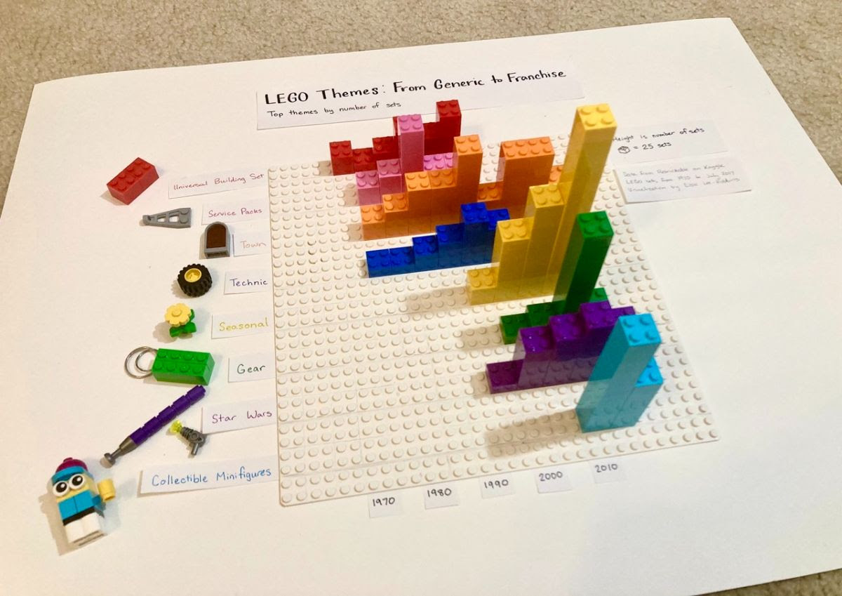
Naturally it’s really cool to see hand-built data viz, and there’s something especially charming about building a chart about LEGOs, with LEGOs.
But I wondered how easy it would be to write a 3D visual that looks like this one.
3D bar charts have a bit of a bad reputation because they’re not considered best practice, but we’re experimenting here, so we can just toss those best practices out the window.
Many people know matplotlib as the go-to graphing library in Python. What you may not know is that it also has the ability to make 3D bar charts (or something close enough); they even have some examples like this:
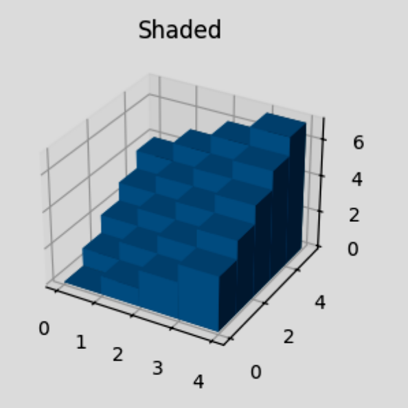
The examples are a great start, even if they’re not really made for this purpose.
The only key changes we need to make are using a different color for each row, and setting the bar height based on data.
So we make the changes, pull the data from the source, and plug it in!
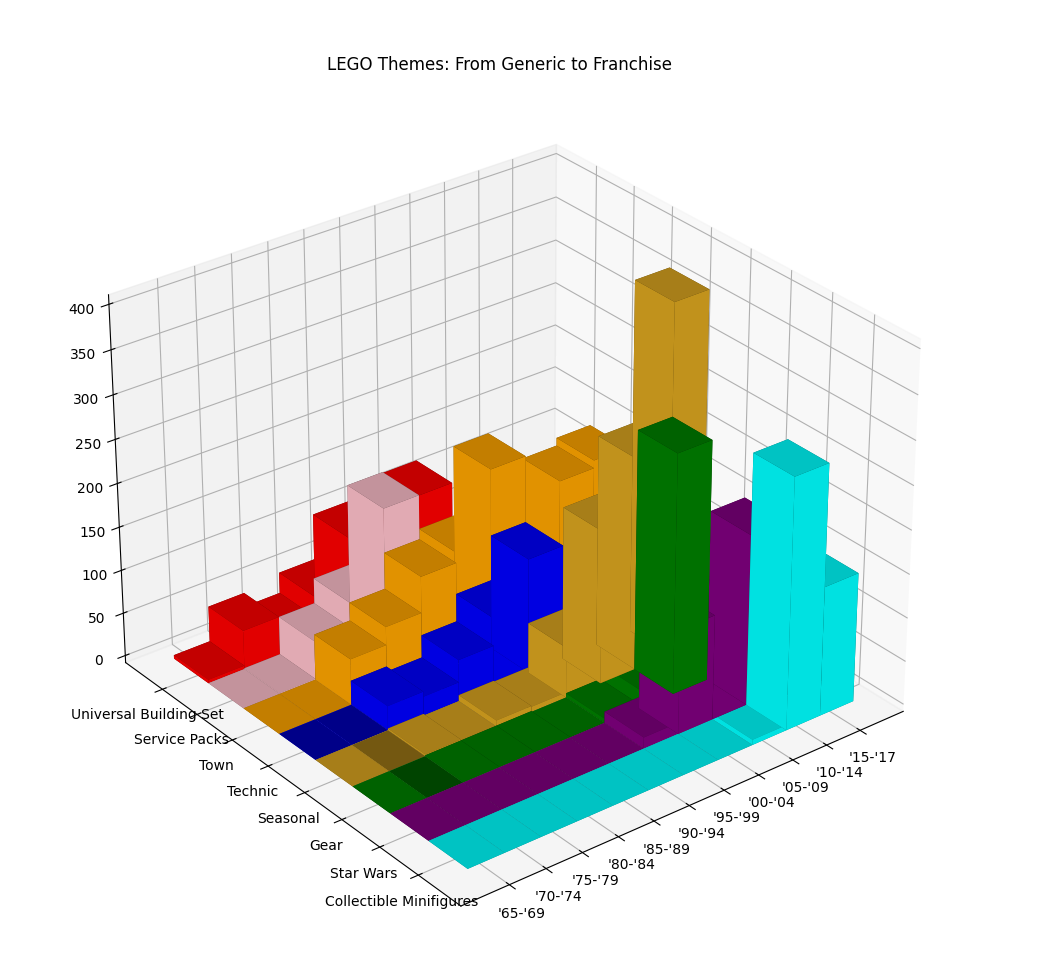
This shows some clipping going on (a known issue), but other than that there’s only a few other tweaks to make it really look like the original.
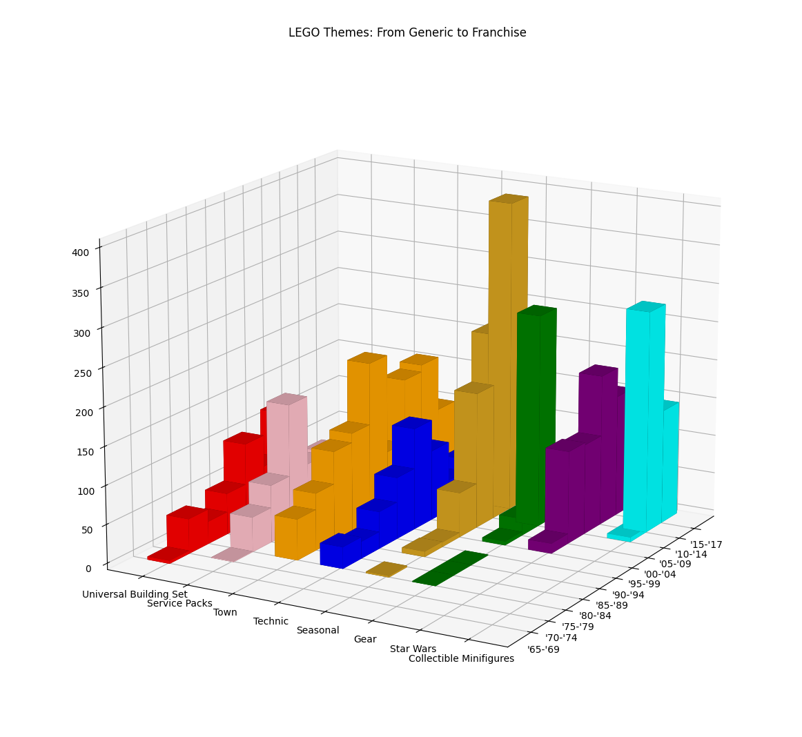
There was still a little bit of a clipping issue, but if we run this script in a terminal it should open an interactive viewer where we can click and drag to change the perspective.
Pretty cool, even if it is restricted and has some minor issues.
3D network graphs with networkx#
The next example is based on the common misconception that 3D makes graphs (or “network graphs” as some people call them) somehow better.
I like to keep an open mind… so why not, let’s try it; again using common Python modules: networkx and matplotlib
I’ll be honest, it’s not that hard to find examples of a 3D network graph (or get your local AI code-sausage machine to churn one out) using matplotlib’s 3D Scatter Plot capability.
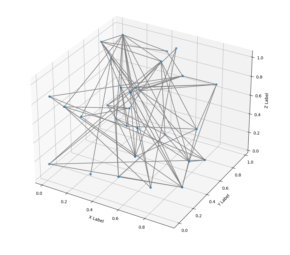
While this meets the definition, it’s got a ways to go in order to be pretty or useful.
One round of aesthetic improvements later, and it does look a little better.
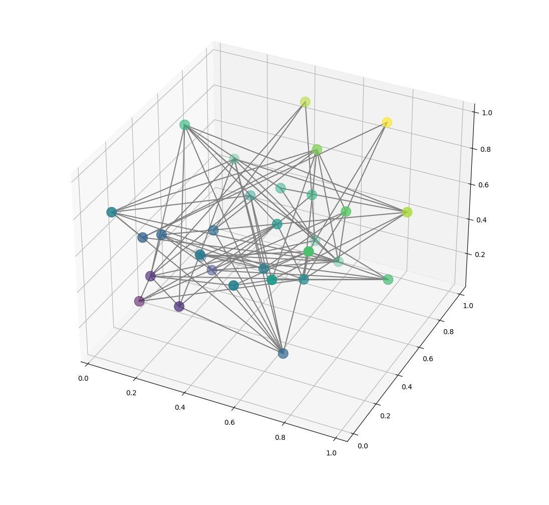
I normally wouldn’t like the axes in the picture, but they make the coloring scheme a bit more obvious: closer to (0, 0, 0) is purple, farther away is yellow.
But the biggest omission is the layout algorithm; one of the single most important factors for the readability and “cleanliness” of graphs like this.
In the example code I found, they just randomly generate positions… like a bunch of barbarians!
Turns out that networkx can actually do some basic 3D layouts, so let’s add that in and see if it helps:
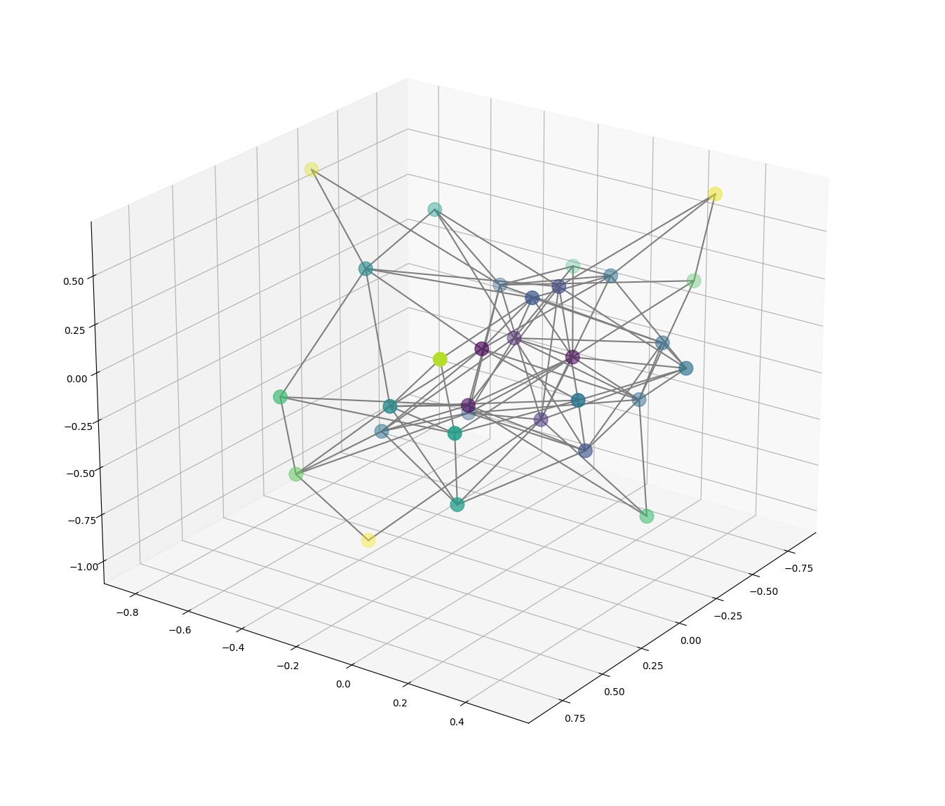
If you feel like this isn’t great… I agree.
The layout has centered the whole graph around the origin, which we can kinda tell by the purple cluster, but the color scheme isn’t quite as apparent even though the node positioning is less random.
We could change the node color logic again, but that would be artificial.
What this graph is really missing is real structure or meaning.
A network graph’s purpose is to help understand connections, and to me a 3D view helps more when showing a specific shape or trend that is most visible in three dimensions.
Naturally a random graph doesn’t contain meaning like that, but in addition to a lack of structure, the sheer amount of visual noise from the number of edges traversing across the dimensions can make it hard to see any trend.
This is actually a serious problem, because this level of connectedness is standard for many kinds of graphs!
Just for kicks I also tried out a similar version using plotly instead, and got an output that looked a teensy bit better to me, but not really very different.
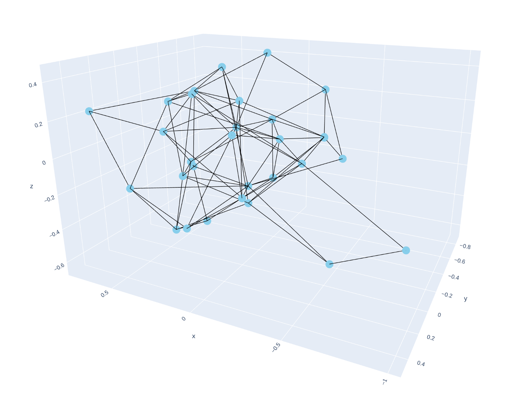
Though it is worth noting that plotly is more geared toward delivering visuals for display on the web that are interactive by default.
Overall, I’m not convinced that 3D network graphs are better for communicating detail, and may be worse overall due to extra dimensions for edge overlap, unless there is a clear shape or trend that really pops out in 3D.
Building 3D shapes with Python#
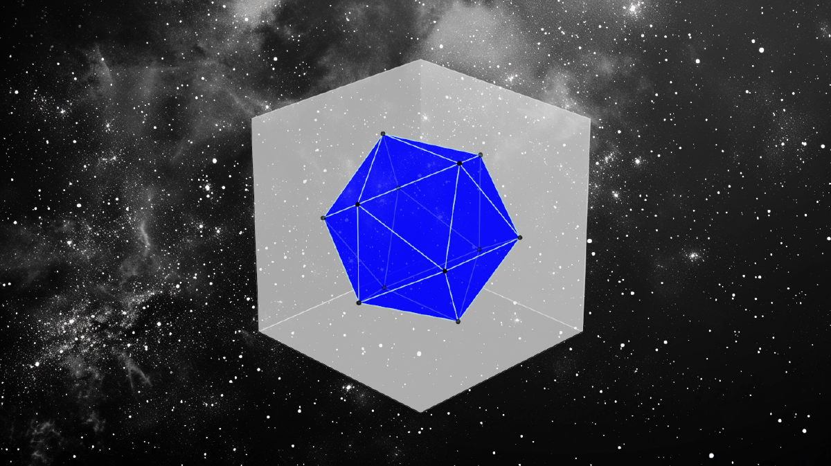
The last bit of 3D inspiration came from a well-known shape that is beloved by many: the elegant regular icosahedron, such as the one seen in Perspectiva Corporum Regularium (1568), though you might be more familiar with this shape as the form of a 20-sided die.
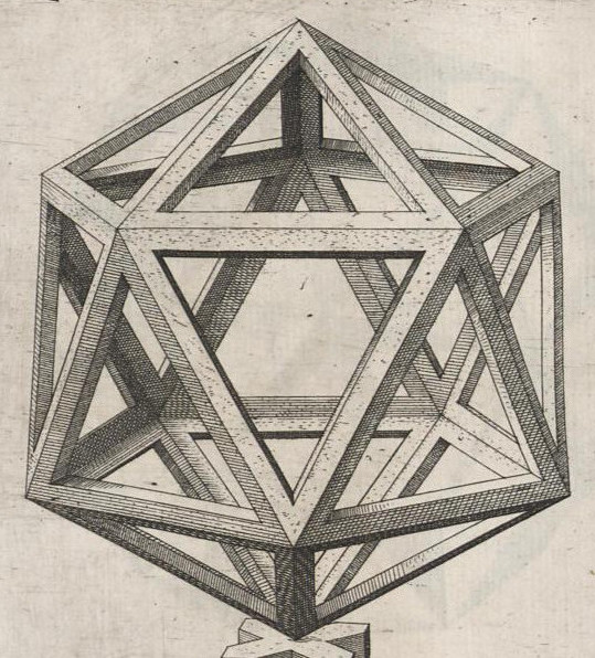
We don’t have to draw all the fancy shading and edging, we just want to render the shape to start.
And since we’ve already seen that we can draw points and lines in 3D space using matplotlib or plotly, at this point it’s just a matter of mathin’ it up.
Personally I think it’s wild how geometry dictates the positions of the points. In theory we could derive these positions from first principles, since we can observe twelve vertices and see that each one is at the intersection of five equilateral triangles.

…But it’s probably just faster to find other people who have posted the code.
Or if we’re so inclined, we can look up the math. It’s funny what things math people will call a “well-known property”.
We also might think this is a perfect place to ask an LLM to write our code for us, and most of the time, that will work! But depending on the model and the specific graphing libraries requested, this apparently falls into the “just hard enough to make an LLM stumble” category.
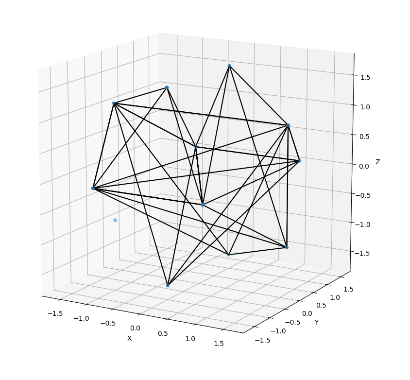
…Good try, Claude. Keep at it.
Considering how long it would take to figure out this code from scratch, it’s a good example of where we should save time by using public code or an LLM, since we’re just trying to get up and running.
Either way, there’s not that much code, so it’s not too bad to get working with a little bit of persistence.
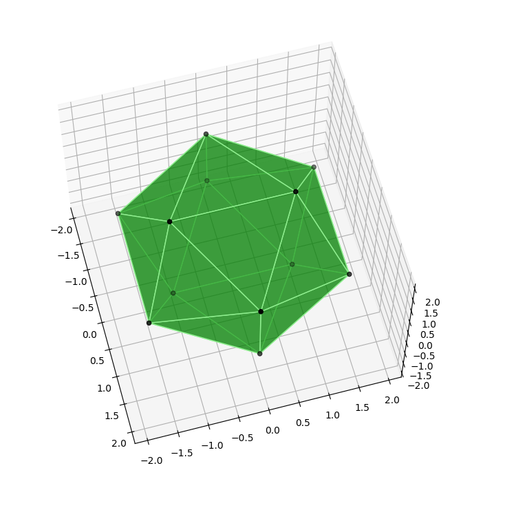
Nice.
Since we can play with the colors, the alpha values of the sides to control opacity, and spin the view around if we want, I’m calling this a win. We’ll save making it prettier for a future post.
Knowledge from the third dimension#
After dabbling in recreating some intriguing concepts, we’ve picked up some useful 3D building blocks using Python.
This is still just the tip of the iceberg for 3D visuals, but it’s enough to get started.
Next time we’ll explore some Javascript 3D libraries to create even more sophisticated visuals. The charting libraries we used in this post were great for getting our feet wet, but they’re just optimized for simpler use cases.
Check out my feeds on the site formerly known as Twitter and Mastodon to keep up with what’s going on.
‘Til next time, keep exploring new dimensions!
