
Perhaps the question I get asked most about some of my visuals is “could you make this 3D?”, to which my response is usually “yes, but it would be worse for viewer understanding…”
At first it was a gut feeling, but after researching and building out 3D visualizations of my own, it turns out there’s some very real considerations that back this up, which is what we’ll delve into today!
We’ll show some specific examples of potential obstacles with 3D visuals such as: optical illusions, weird projections that can make viewers sick, and smart camera control choices.
Note that the focus here is on “explanatory” 3D visuals, where the emphasis is to quickly and intuitively communicate information to a viewer, rather than on “exploratory” visuals where the user is supposed to wander around. I think this is interesting because it goes against the strengths of the medium; I find 3D to be better suited in general for exploratory experiences.
Faking the Escape from Flatland#
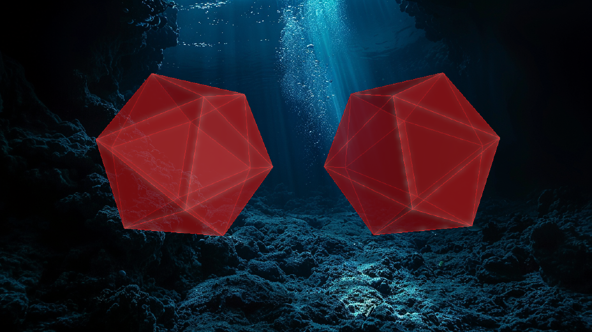
One of my biggest disappointments about the last post on 3D was that I resorted to using screenshots of 3D visuals due to time constraints.
The picture below doesn’t communicate the depth of the interactive visual it’s based on; if the viewer were to run the code on the command line as I did while making it, they would see that they can grab the shape and rotate it, as well as zoom the camera.

You can tell it’s supposed to be 3D even though you can’t interact with it. …So why do we think it’s 3D?
Since we experience visuals like this on a flat screen, it doesn’t really have depth. The only way such an experience can truly show the third dimension is when either the viewpoint (aka “camera”) or objects in the scene move.
Without this movement, our brains infer depth primarily based on two things: lighting and perspective.
Lighting is pretty straightforward: our brain deduces depth and spatial relationships because we know light behaves, and how 3D objects receive light and cast shadows.

Perspective just refers to how we know that closer objects look bigger and things further away look smaller, and also that closer objects will block farther objects from view.
It’s much more nuanced than just that though, because our brains are really good at interpreting depth due to subtle perspective cues.
Take this picture of a rad-looking lamp: the illuminated surface is actually just a flat piece of plastic, but it totally tricks our brains when we view it from this one angle (much to the chagrin of many purchasers, I’m sure).

Without more points of view, this image is ambiguous: the lamp could be an awesome hologram with real depth, or it could be a glorified cardboard cutout.
Effective 3D visuals typically disambiguate and demonstrate depth via movement of the objects in the scene or the camera itself, where the shifting of perspective matches our expectations of a three-dimensional space.
3D: The Camera is the Obstacle and the Way#
It’s easy for us as humans to forget about the importance of cameras for three-dimensional experiences, because our cameras are built into our skull and we carry them around as we move about the world.
3D graphics give us the option to depart from how things look when seen by the human eye, so while it’s usually more taxing on the viewer to do this, I think the options themselves are interesting and lead into other topics.
Using the Javascript library three.js, there’s three things we need to make a 3D scene:
- The place where the projection of the 3D scene will be displayed (the “renderer”)
- The camera, which has both a position and a set of parameters that are used to make the projection
- Objects in the scene that the camera will view

We can even add elements to depict the camera and its overall position in the scene; the camera position from the first picture is shown below by a yellow cube, with yellow lines indicating perspective and a white line indicating the direction the camera faces.

We also can specify some parameters that vastly change how the view from the camera gets translated into a 2D image.
The parts that are most relevant are the projection type and field of view (FoV), because these allow us to define visuals that deviate from what we would experience through human eyes.
The FoV specifies in degrees the extent of what the camera can observe, for example most first-person video games have an FoV between 70 and 80, but we can keep increasing it to the point where it starts to look pretty strange.
The images below show how increasing FoV allows the camera to see more of the scene at the cost of becoming more warped.

Heads up: setting FoV too high or too low can make viewers nauseous, especially if there’s a lot of camera movement and it’s being viewed on a large/close screen (check out this article for more).
Projection type is the other potential departure from our expected reality: we expect that things that are farther away are smaller, but that doesn’t need to be the case.
In the screenshot below we switch to an Orthographic projection which removes the skew as things get farther from the camera, making the objects look the same size despite being different distances from the camera.

Let’s admit that some experiences utilize some of these for artistic effect, and some of those are pretty cool…
But when it comes to making visuals that are clearly understood, we’re better off with a standard perspective-based projection that mimics the human eye.
The next crucial aspect we glossed over is that camera placement and movement play a big part in making a visual easily understood.
Camera Movement: Balancing Simplicity and Interactivity#
It’s easy to forget that when viewers encounter an interactive visual for the first time, they have to learn how to interact with it, and this can be both a challenge and opportunity.
This is especially important for 3D visuals because a single image isn’t enough to immerse the viewer in the third dimension; we need movement.
The basic options are either to give the user control, predefine the movement, or use a mix of the two.
Giving the user control seems like the easy default, and a lot of folks opt for it, but it clearly introduces a hurdle: viewers have to learn the controls to move the camera by trying to move through the scene.
Depending on the scene, this can be confusing at first, because even if we display text describing the controls, the user is still going to play with them to really understand them (e.g. does “left” mean “rotate left” or “translate left”?).
Some viewers like this because it might feel like a game, but depending on how much movement is needed, it can turn into a chore.

One possible improvement is to use a second view to help the viewer understand where the camera is positioned, such as a mini-map, but this does mean an additional visual element that we have to implement and manage in terms of visual layout and viewer experience.
The alternative is to predefine all camera or object movement, which is nice because it allows us to dictate the view and removes the burden of camera manipulation from the user.
This means the visual requires no action on the part of the user, but this can be frustrating if the user wants to stop and look at something in particular. We can always add overrides like responding to a click or a hover, it’s just on us developers to do the extra work to implement them.

The one major weakness to a gentle orbiting camera like the one above is if the objects in the scene are moving in a way we want the user to understand. In that case a steady camera is better, perhaps with a user controls that allow pivoting around a central point.
One of my favorite hybrid options is to allow the user to move the camera between predefined positions and optionally look around, which can be really nice if particular views give different insights into the visual.
The real question to ask is “what are you trying to show?” and focus on that.
Regardless of whether we opt for user control or not, the initial placement of the camera in terms of distance and angle is critical.
I’ve found picking a position and direction where the viewer can see everything or see a larger floor or backdrop (like the axes in the previous post’s images) helps orient the viewer and removes questions of what else is in the scene.
Beyond that, it’s helpful to optimize for minimizing occlusion and maximizing the clarity of spatial relationships.
Seems like that would be a given, but we can find 3D visuals that don’t do this and can be hard to understand even in a fully interactive format.

The last trick I’ve found is that if you feel like the “zoom” is wrong no matter where you put the camera, adjusting the relative space and size of elements can help. Because for things like showing a solar system we might need to use log scales or exaggerate the sizes of things.
Bottom line, camera placement and movement can really make the difference between feeling like the third dimension really has depth and is used.
A Quick Comparison with 2D#
So by now we can see that since 2D visuals don’t have the concept of a camera, they are by definition simpler and avoid a lot of the complexity that comes with 3D visuals.
The primary benefit is simplicity via clarity of spatial relationships: there’s no potential for ambiguity like in 3D space. Relative sizes are clear, and viewers don’t need to move the camera to understand how far elements are from each other.
Also there’s no risk of incidental occlusion; we can see and fix it if things are overlapped or hidden in two dimensional space.
In both 2D and 3D we can overwhelm viewers if we show too much information, but my observation is that people tend to fall into this trap more with 3D.
It’s ok to pack objects into the third dimension and use that for artistic effect like the visual below, but at this scale a viewer is only going to be able to absorb generalities, not details.

With all of this being said, 3D has a huge advantage when it comes to things that people already think about in three dimensions such as physical objects, familiar places, etc.
And well-designed 3D visuals can be immersive and fun in a way that’s hard to replicate with 2D.
Inter-Dimensional Balance?#
We’ve explored what makes things feel 3D, camera/projection choices, and the relationship between camera placement, interactivity, and clarity.
This gives a taste for some of the parameters and decisions that go into making 3D scenes, maybe this makes you want to stick to 2D visuals or maybe you’re feeling encouraged to try out 3D?
Either way we can see and think about more of the details for both things we make ourselves and things we experience as viewers.
I really hope this trip into some of the details of building 3D visuals was fun and helped you see things from a different angle. I’m planning to get back to more programming- and security-focused posts in the future, but if you enjoyed this trip into graphics-land, please let me know on your social of choice, my DMs are open :)
Til next time… stay curious!