
Software reverse engineering (RE) has been both a hobby and something I’ve done as part of my work over the years, so needless to say I’ve spent a lot of time trying to understand code that somebody else wrote…
RE may seem mysterious to people who are used to standard software development, but it’s not that different from reading someone else’s code and figuring out what they were doing and how to use it. It definitely is hard if you don’t have the benefit of source and symbols, because then it’s like being dropped into a hedge maze without any signs, or if they exist, they might be confusing or unhelpful.
But RE is also hard for dumb reasons too, often related to tools (or lack thereof) for some tasks, and as a developer I often feel the desire to stop there and start building a solution.
As Halvar Flake mentioned in his 2018 keynote on the state of RE, some people seem to take pride in using poor tooling to get the job done, but I’m with him in that if I’m going to dig a ditch, I’d rather use a bulldozer than chopsticks.
Along those lines, I built a Binary Ninja plugin Ariadne that presents interactive graph visualizations of RE data because it was the tool I really wanted to have, so today I’m going share some of the problems I built it to solve and why I think it could be helpful for a variety of RE tasks.
The heart of software reverse engineering is understanding#
The fundamental task in RE that I do over and over again is orienting myself whenever I’m looking at a new binary or piece of code. In RE there’s a ton of stuff to look at, but you only have limited time to understand enough of the big picture in order to find and focus on the details that matter.
Standard RE tools (Binary Ninja, Ghidra, IDA, etc) focus on finding and presenting correct disassembly or lifted pseudocode for specific functions, and they do a great job of what is a really difficult problem.
But understanding the big picture is hard when you’re looking through a microscope like this, because software is made up of many functions (OS kernels and firmware can have hundreds of thousands of functions), and we need something to help us with orienting and understanding the relationships between functions.
The most natural relationships between functions is the call graph, and tools have been trying to make this functionality work for a long time now because its feels the most intuitive in terms of describing code structure.
In some cases a picture of the callgraph can be very helpful, but more often in my experience I’d end up with a hairball graph that I was either illegible or unusable because there was just too much to show effectively.
Realities of scale#
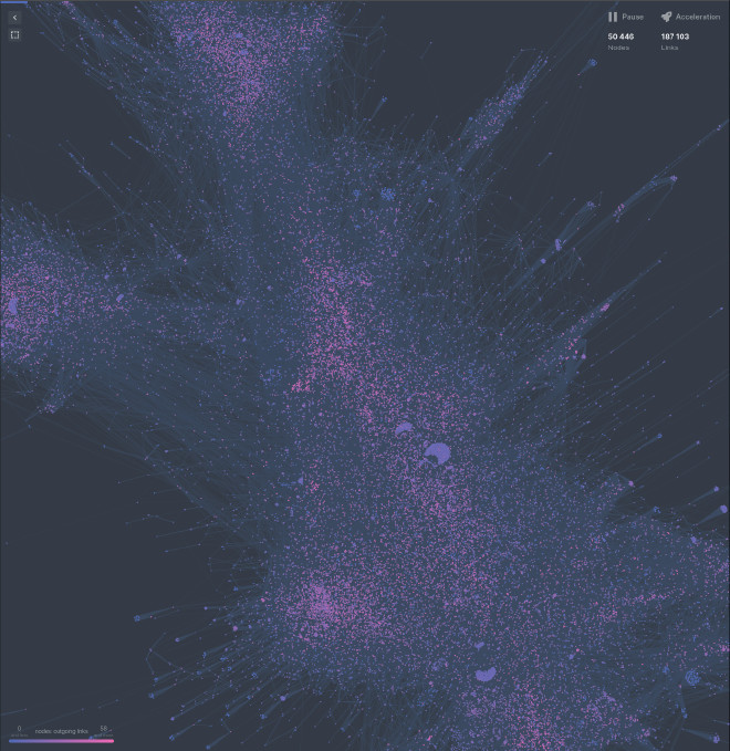
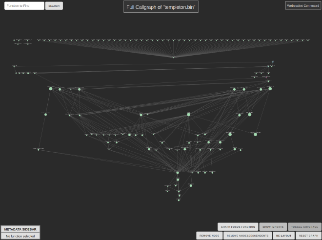
As I mentioned, real software usually has hundreds or thousands of functions. If you drop the callgraph for something that big into graphing software (even excellent ones), you end up with something that is pretty at best, but most likely not useful for RE.
Like this beautiful but not super helpful callgraph of a NodeJS Linux binary:
The key realization I had in building Ariadne was not that I wanted one graph that I could stare at all day, zooming in and out, gaining new insights… because the scale just makes everything difficult to work with and too much data is just unhelpful. Instead we need to be able to look at just the right amount of information to start, and then filter down.
This means we don’t want a picture but a graph tool that is flexible, so we can focus on what we need to find out in different situations… so that means we’re going to have to make an interactive visualization, but it starts with rendering a good picture as a starting point.
A picture is worth…#
A lot goes into getting a good graph, and lots of tools have been focused on this, so I wanted to start by looking at what I could use.
My first thought was to use Binary Ninja’s builtin FlowGraph API, which is what they use to make pretty graphs for function control-flow graphs.
But even for a toy-sized binary, the result was not what I was hoping for…
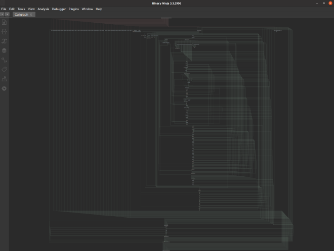
The key difference is that CFGs tend to have a small edge-to-node ratio and clear hierarchical structure and callgraphs often have neither of these things. So when RE frameworks optimize for displaying CFGs, that means their layout algorithms don’t tend to work as well on callgraphs.
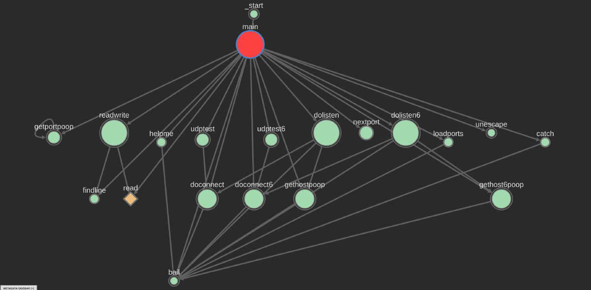
Even in well-structured code, callgraphs still be tough to layout “perfectly” due to the number of edges and how there are common exceptions to a clean hierarchy, especially if you don’t differentiate between imported system or library functions. But a well laid-out graph can at least give a more intuitive idea of the structure, for example this graph of the exact same binary as the picture above:
But once you do have a decent layout with nice colors, the result won’t be right for every use case, which is why we go back to the interactivity requirement, which is not a small ask since we’re talking about a lot more than just zooming and panning around!
The basic requirements I found for a useful callgraph visualization are: to be able to move nodes at will, to be able to hide imports with a toggle, to delete nodes and redo the layout, and to be able to highlight the calls to and from a specific node.
Ariadne’s frontend allows all of these and more, so with those things in hand, now we can start solving RE problems.
Common strategies for ditch-digging with a roboshovel#
RE is nuanced work that requires different tasks depending on your ultimate goal, but there are some very common workflows for which graphs are helpful, and Ariadne supports them.
The basic out-of-the-box experience is that as you move between functions you see the subset of the callgraph around your current function, which is extremely helpful for orienting as you drill down through a binary.
The key with function neighborhoods is to not try to show too much, because too large of a graph is just an eyesore and tends to make my brain shut off… for this reason, Ariadne limits the default neighborhood shown if bringing in more “hops” would put too many nodes on the graph.
One of the other super-common workflows in RE is looking for source-sink relationships, like the old classic of finding all the ways untrusted input can come from recv and make it into a dangerous function like a strcpy or system.
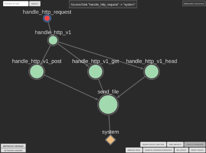
Ariadne supports this with a basic wizard using Binary Ninja’s user interaction, and this makes the source-sink problem easy and gives you a nice visualization.
The true flexibility though is that Ariadne can display arbitrary graphs since it just constructs callgraphs using the well-known Python module networkx.
This allows users to implement any graph analytics they want and display graphs for arbitrary sets of functions. The only limitation is that the layout could take a long time for large graphs, because doing a clean layout is computationally hard.
There’s more that Ariadne can do, especially with coverage analysis and improving testing and fuzzing, but we’ll save that for a future post.
Your turn to try it out!#
So we’ve talked about how having an interactive graph helper can help understand the big picture and focus on specific details, and there’s even a lot of features that we didn’t even get to today (like how all the colors, sizing, and buttons were picked for specific reasons).
You won’t really know until you try it out yourself anyway, so if you’ve Binary Ninja you can install it via the plugin manager or cloning the GitHub repo.
If you found this tool or these ideas interesting, follow me on Twitter to stay updated as I release more in the realms of the software development, software security, and visualizations.