
Do you ever find yourself looking at code that you think should work, but it doesn’t? Sometimes I find myself wishing I could just see what was going on because it would make troubleshooting easier, and this led me to the idea of using visualizations to aid with debugging and overall understanding.
And we’re not just talking about printing nicely formatted letters to the terminal, we want to try generating diagrams that tell us what I want to know right away.
We’re going to give this a shot on two problems from the most recent Advent of Code (AoC), an annual programming challenge. Let’s see if we can’t make some pictures that would’ve been reallllllly helpful to me when I was actually trying to solve them.
Visualizations for programming problems?#
Let me start by saying I’m not one of those wizards who solves AoC problems in record time, and taking time to build visualizations is probably only going to save you time if you’re really struggling and you know exactly the picture you wish you had.
But!
I think that having a visual reference can both help you understand the problem and what might be wrong with your solution. In fact, I think one of the reasons AoC is so approachable is because the author often uses ASCII diagrams to explain what the problem “looks like” or what a solution might need to do.

Certainly just printing out text is probably faster than building custom visuals, but if you’ve got the right tools in your toolbox it’s not too bad.
Visualization tools#
There’s a few decent tools out there for general data visualization (gephi for example), but personally I prefer APIs over tools because I enjoy being able to create whatever I like without restricting myself to bar charts and scatter plots.
Since Python is my go-to language, I’m going to start with networkx for graph structures/algorithms and use Matplotlib for making graphs since it works pretty well out of the box.
Beyond Python, the Javascript library d3 comes up in my searches more than anything else, and it has an impressive gallery of examples like the one below, so we’ll give it a shot for our examples.

Using d3 means operating in an HTML/CSS/Javascript environment, which certainly gives more control, but it’s not always easy because there’s a lot of details that can catch you off-guard. I’ve been trying to upgrade my skills in this arena from “Javascript caveman”… but it’s still a work in progress :)
Making a graph with Python#
As a heads up, I’m going to show intermediate steps and mistakes I made along the way in order to more closely reflect real problem-solving and not give the false impression that I got everything right on the first try. The final product is in this repo.
Let’s start by trying to do the easiest thing first: just show a graph of our data in some way!
The AoC Day 12 problem, is a fairly straightforward hill-climbing problem where the heights in a grid are described by letters and we want to go from the start (S) to the peak (E). When I first started on it, my solution worked on the smaller test example but failed on the actual input, and I couldn’t tell why…

Debugging turned out to be a little tricky because I was doing breadth-first search, so it wasn’t obvious what criteria to use for a conditional breakpoint, and single-stepping wasn’t realistic due to the size of the search space.
Ultimately I ended up using text diagrams like the one above, but it was annoying and took way too long.
Afterwards, I realized that modeling the problem as a graph would’ve let me reduce the code I had to write and offload the pathfinding work to networkx… which would have been better -_-
Using networkx like this means all you have to do is iterate through the coordinates and write one function that determines whether you can go from the current space to each of the neighbors:
import networkx as nx

g = nx.DiGraph()

directions = [
    (-1,  0),  # left
    ( 1,  0),  # right
    ( 0, -1),  # up
    ( 0,  1),  # down
]

for y in range(height):
    for x in range(width):

        cur_pos = (x, y)
        for (dx, dy) in directions:
            other_pos = (x + dx, y + dy)
            if can_move(cur_pos, other_pos)):
                g.add_edge(cur_pos, other_pos)
Then it’s pretty simple to just graph this with matplotlib…
import matplotlib.pyplot as plt

nx.draw(g, node_size=2)
plt.savefig('directed_graph0.png', format="PNG")

Ok, so you definitely need to look at the parameters and figure out the right arguments to manage the layout and the number of nodes if you have a lot like we do here (my input was 4,674 nodes and 16,975 edges). By default, you’re going to get a force-directed layout, which isn’t what we want.
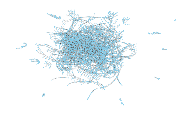
Using a more structured automatic layout algorithm isn’t right either, but it does look kinda cool.

But if you set the positions, colors, and labels yourself, you get something more usable. Technically you can use the resulting diagram to figure out what I did wrong, but it isn’t easy.
position_dict = {}
colors = []
labels = {}
for cur_pos in g.nodes:
    x, y = cur_pos
    position_dict[cur_pos] = [x/width, y/height]
    # Color start and end
    if cur_pos == start_pos:
        cur_color = 'green'
    elif cur_pos == end_pos:
        cur_color = 'red'
    else:
        cur_color = 'skyblue'
    colors.append(cur_color)
    # Alphabetical height labels
    labels[cur_pos]= grid[y][x]

plt.figure(figsize=(40,24))
nx.draw(g, pos=position_dict, labels=labels, node_color=colors, node_size=160)
plt.savefig('directed_graph1.png', format="PNG")

It’s more helpful to first determine which nodes are reachable via the
can_move() function that defines the edges, and then color all the nodes that
are unreachable, like this:
reachable_nodes = nx.descendants(g, start_pos)

updated_colors = []
for i, cur_pos in enumerate(g.nodes):
    if cur_pos in [start_pos, end_pos] or cur_pos in reachable_nodes:
        updated_colors.append(old_colors[i])
    else:
        updated_colors.append('orchid')

We can see (with a little zooming in) that there’s a bit of a spiral pattern on
the peak and if you look really
closely, there’s a blue peninsula with the letter l right next to some j
nodes.
Which means that I had assumed that you could only go one up or down, when the problem description does in fact mention that while you can only go up one letter, you can go down any height differential.
…boy did I feel silly when I realized that.
def can_move(cur_pos, dst_pos)
    # ...snip...

    # Test height difference to determine validity
    difference = ord(dst_pos) - ord(cur_pos)
    # RIGHT
    if difference > 1:
        return False
    # WRONG
    #if abs(difference) > 1:
    #    return False
    return True
Fixing that one issue made my solution work; finding the shortest path with networkx:
print(f'Answer: {nx.shortest_path_length(g, start_pos, end_pos)}')
Making d3 graphs from Python data#
Using Python alone gave us a workable solution, but I really wanted to see if I could make something better (and I also wanted to see what all the fuss is about d3).
I found that the real strength of d3 is that it allows you to take data such as the heights from this problem, and smoothly map those ranges onto other domains, like x/y coordinates or colors, as we’ll see.
To bridge between Python code and d3, we need to export the data from our current script. One way is to describe the data points as dictionaries, then write the array of those data points to a JSON file:
import json

node_data = []
for y in range(height):
    for x in range(width):
        height = grid[y][x]
        # covered indicates reachable coordinates
        # or nodes in the shortest path
        covered = (x,y) in reachable_nodes
        node_info = {
            'pos': (x, y),
            'x': x,
            'y': y,
            'i': len(node_data),
            'height': height,
            'covered': covered,
        }
        node_data.append(node_info)

with open('day12-data.json, 'w') as f:
    json.dump(node_data, f)
Graphing the data with d3 is nowhere near as concise as the Python was, so please refer to the repo if you want to look at the code, but I’ll give a short summary.
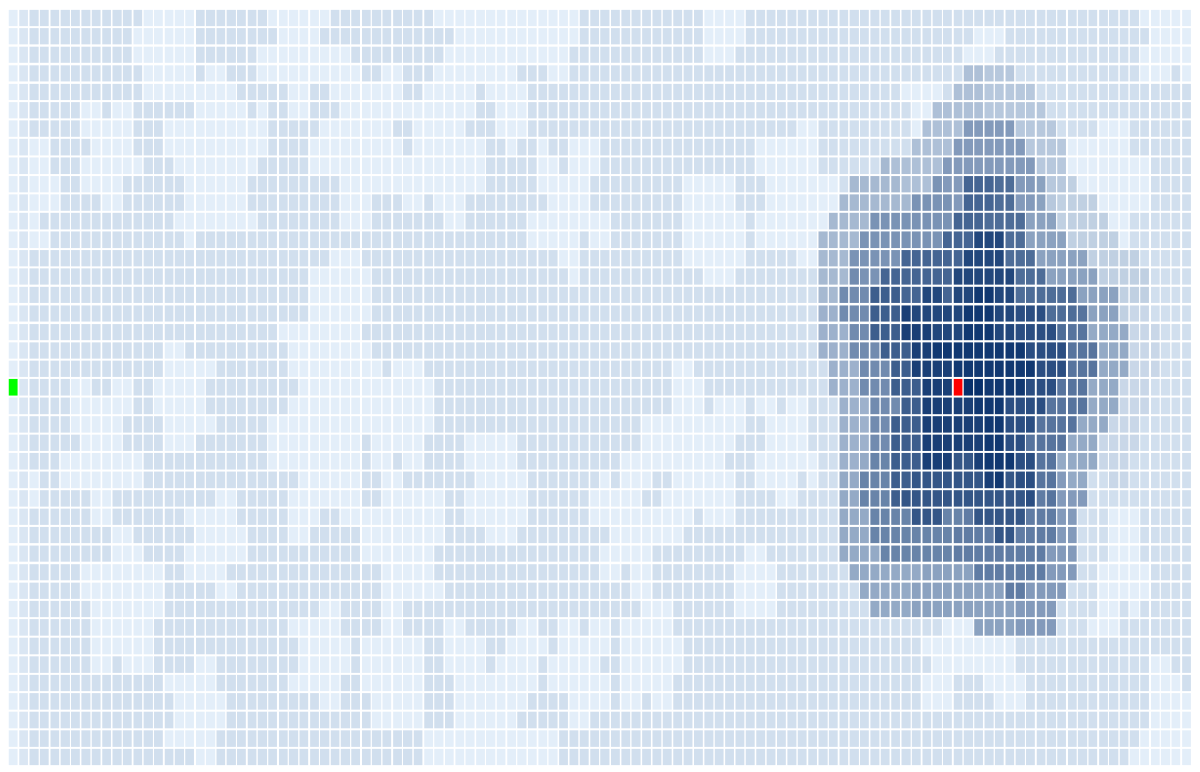
To make the grid of rectangles, we’re defining mappings between the range of x- and y-coordinates to x- and y-positions in an SVG. Then we’re mapping the height data onto a range of colors (the shades of blue) with exceptions for the start and end point.
Doing this gives us a starting point, but if we label the spaces and highlight the reachable nodes, then we have a graphic that looks nice AND can also help us quickly identify where we fail to continue up the peak.

We can also reuse the same graphic to show the shortest path once we have it:

Nice! Having visualizations like these would’ve been more helpful than counting letters in the terminal…
Using d3 to make a custom graph#
As a bonus, let’s see if we can come up with most of a solve for one of the problems: on day 17 we’re basically asked to simulate Tetris, but in the second part we’re asked to extrapolate so many iterations in the future that it makes simulation intractable.
Intuitively we’d think it has to repeat or have a pattern given that we can’t simulate out to the answer. And if we knew the length of the cycle before repeating, then rest is straightforward.
But graphing of the height of the blocks doesn’t do it, even with our pretty d3 graphing capabilities, because if we add too many data points it just looks like a line, and there isn’t an obvious pattern with a smaller number of data points.

Now since there are only 5 block types and they always follow the same order, maybe we can separate those? But again we see that too few datapoints doesn’t show the pattern and too many hides it.

But if we separate the blocks and then graph the x position of the last part of the block as well as the height, now we can display more data points and see a pattern! I find it easiest to see in the red blocks, but you can see they all tend to repeat.

Adding a tooltip to show the data as you hover over each square adds extra complexity to our code, but it makes the answer pop right out.


And as a bonus, while adding more data points does cause more overlapping, that actually makes the pattern easier to see since isolated dots with space around them stand out more. The picture below is static, so the arrows are there for clarity since it doesn’t have the hover tooltip functionality of the full visualization:

So in this case we can see the length of a cycle and verify that it repeats with just this visualization. Having that data makes it so we can model the height of the blocks for any number of iterations into the future.
Resting our eyeballs, for now#
I think this idea of using custom visuals to show underlying patterns or help debug our code is pretty interesting, and I plan to explore it some more in the future. Even if my experiments hadn’t turned out as pretty as these ones did, I still got to practice using d3, networkx, and matplotlib on interesting problems.
If you were looking for more about Ariadne, stay tuned for more on that and similar applications to security.
Are there any programming problems you think would be cool or helpful to visualize? Tweet me @seeinglogic or send me a DM. Thanks for reading!